How to Shoot Epic Landscape Selfies – 6 Top Tips How to improve your landscape photography by adding the human element

Over the last couple of years I’ve been adding more of the human element to my landscape photography and I’ve got to say, it seems to have boosted the popularity of my portfolio.
People seem to be more engaged and feel a deeper fascination with landscape photography that includes a human being. It’s not just a matter of showing the scale of a location, I think people enjoy the opportunity to vicariously explore the places that I take them to.
Imagine Yourself Right There
By visualizing what it’s like to exist within a stunning vista, the viewer can project themselves into the scene and almost feel the extreme cold or heat, the smells, the sounds and general ‘vibe’ that’s unique to all places. At least that’s my goal. My other goal is to inspire people to travel and experience this amazing world for themselves.
If you fancy trying your hand at nailing the ultimate landscape selfie, here are my 6 Top tips to get your closer to epicness
1 – Throw Away the Selfie Stick – Use a Timer
If you want to capture a natural looking landscape that features the human element, forget the selfie stick and start using a self timer on your camera. Even smartphones have a 10″ timer these days so if all you have is your phone there’s no excuse to use the selfie stick.
Selfie stick shots are fine for ‘run-n-gun’ documentaries, ‘action selfies’ or ‘we are here’ shots but if you want to put some distance between you and the camera you’ll need to put the camera down and program a self timer.
By putting your camera on a tripod, gorillapod or even just standing it on any stable surface, you’ll be able to compose your shot without your own body taking up half of the frame and obscuring the landscape.
2 – Position Yourself For Scale and Drama
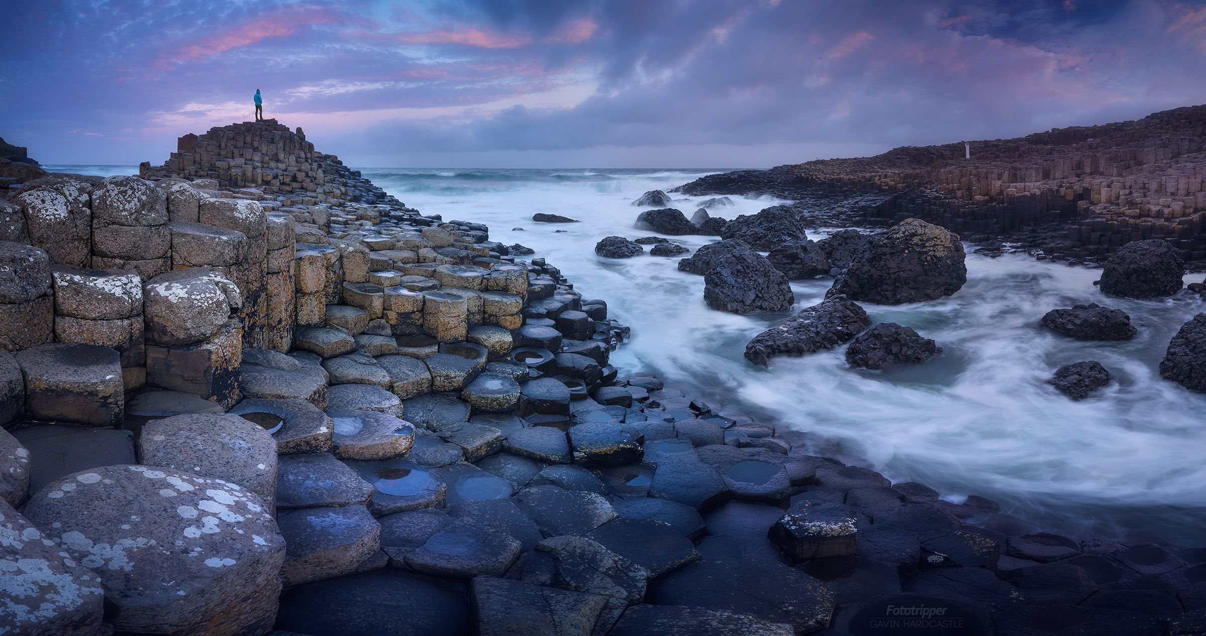
If you’re taking a photograph of a place that features scenery on a large scale, placing a human in just the right spot can really emphasize that sense of scale. It’s often quite obvious where you’ll need to place yourself or your model but if you’re struggling to figure it out here are some pointers.
- Offset the human figure with the largest object in the scene. So if your landscape features a huge waterfall, place the human figure in the white column of water to emphasize the sheer size of the falls.
- Put the human figure in a position that looks precarious and provokes a reaction in the viewer. Such as a cliff edge (when safe) or standing over the cracks of a frozen lake. What might look daring to the viewer may have been totally safe and easy in real life.
- If you’re scene features reflections, place your human figure where it too will be reflected, thus doubling the drama.
3 – Try to Look Generic or Anonymous
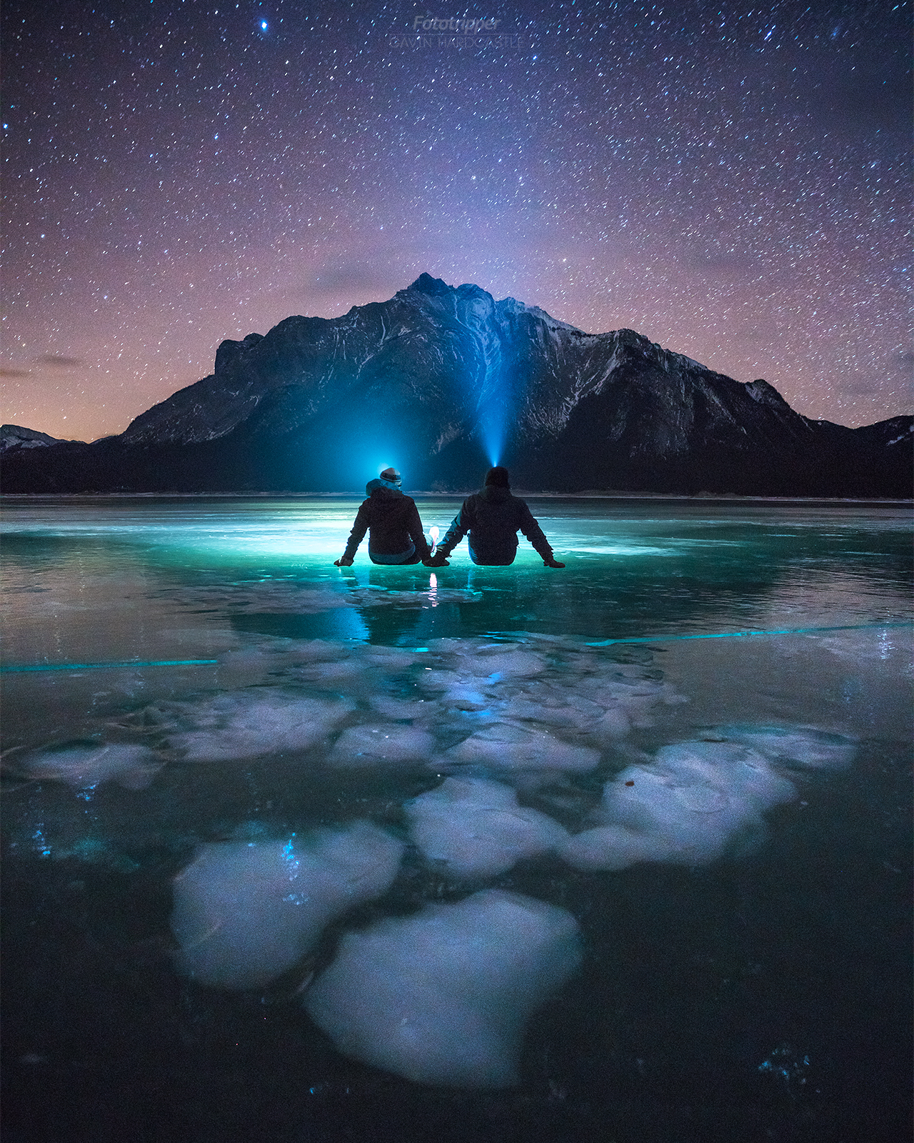
You may have the best collection of stylish hats in the world, but unless you’re appealing to a specific demographic, there’s a chance you could trigger a disconnection of association in your image if you or your model are too stylistic.
I’m not saying you shouldn’t feature stylish features if that’s your thing, but if you want to appeal to a wider audience you’re going to have to let go of your ego and become generic. As a viewer, I find it much easier to imagine myself as the explorer in the image if I can’t see the models face or their particular style or attitude.
4 – Add a Light Source

If you plan to shoot nightscapes or blue hour scenes you can really draw attention to your model and other parts of the scene by adding an additional light source. As much of a cliché as the headlamp has now become, it’s still better than nothing. I’ve begun to experiment with different positions of light source so that the model is nicely lit without the obvious headlamp cliché but at times it still works great and really makes the shot.
5 – Don’t Take Over – Just be an Element
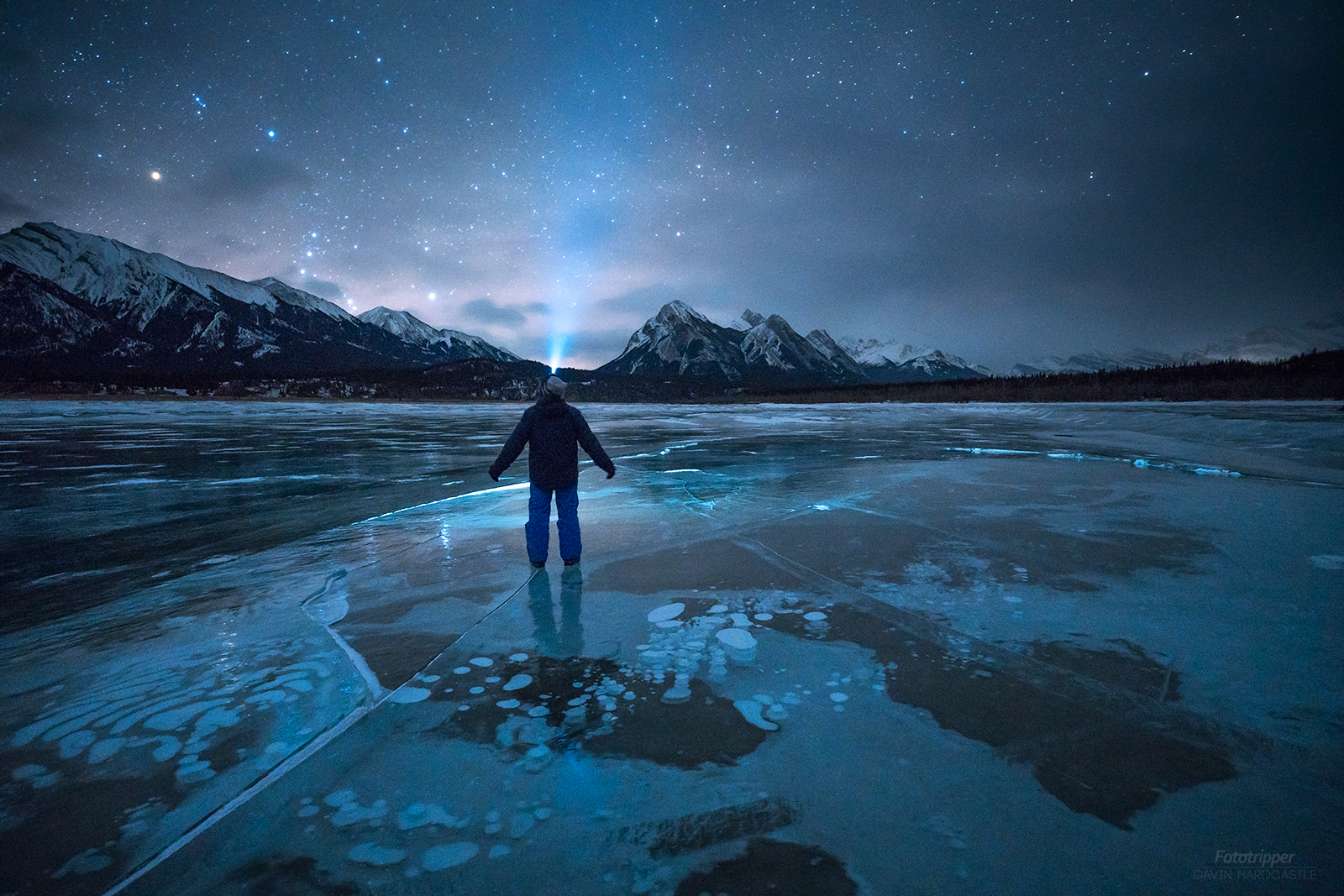
I want to stress that what I’m talking about here isn’t portrait or conceptual photography. I’m talking about landscape photography that features the human element. With that in mind it’s important that you or your model become part of the scene and not the main subject. Its easy to achieve this by simply keeping the scale of the human figure in your shots under control.
So for example, if your human figure takes up 50% of your frame, you’re too close. Move out into the scene a bit more and become an element instead of the main subject. If you look at all of the examples shown on this page, you’ll see that in most of them the human figure takes up less than 20% of the frame.
6 – Wear Contrasting Clothing
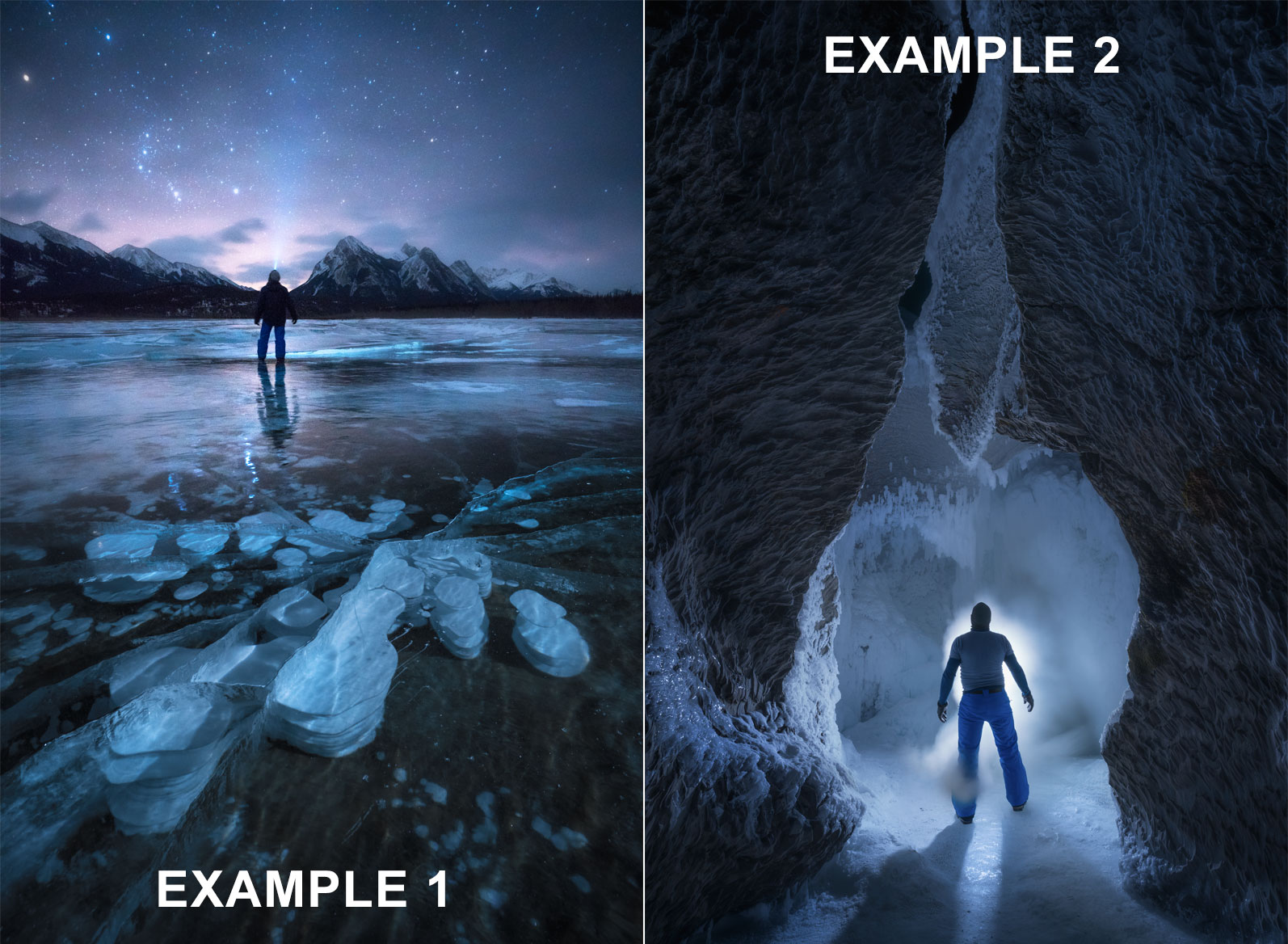
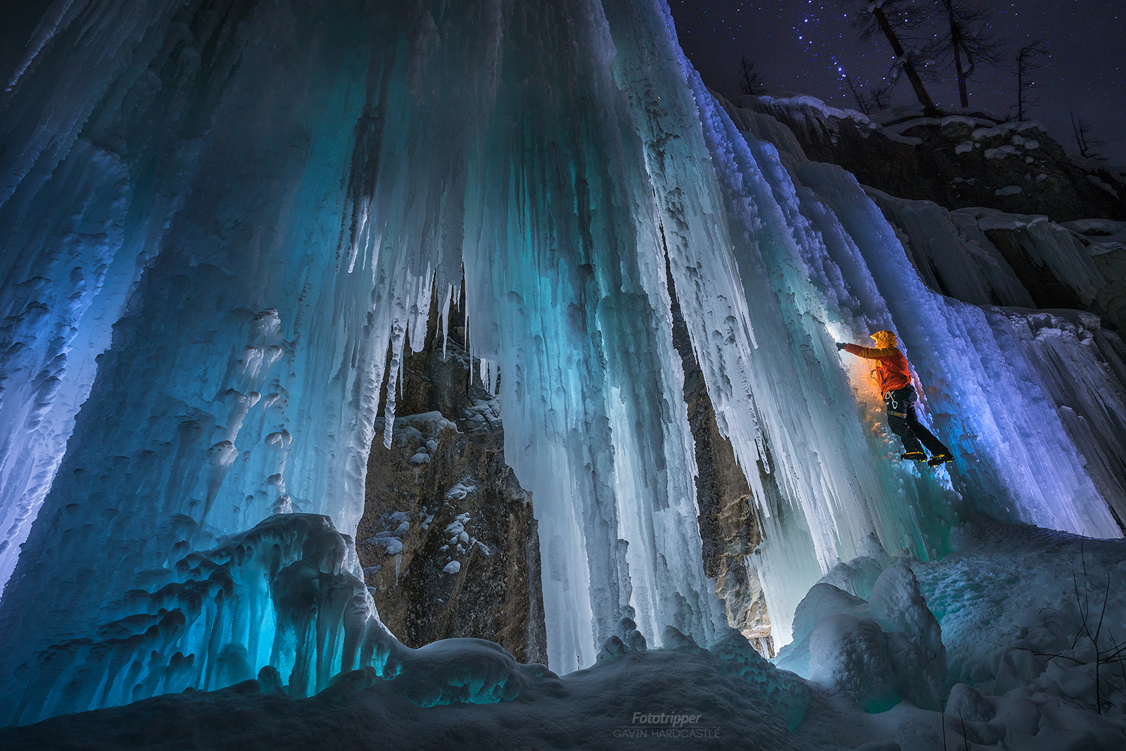
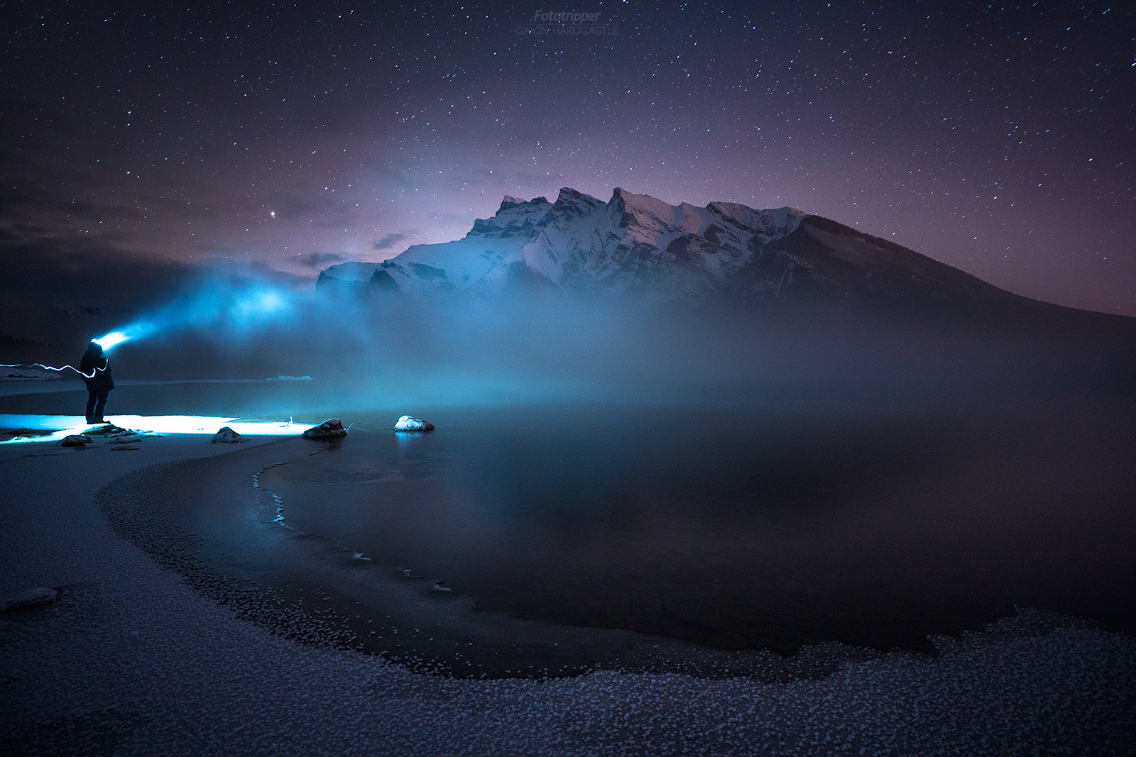
I’ll start this part by explaining what NOT to do. If you’re shooting a dark nightscape, don’t wear dark clothing like I did in EXAMPLE 1. It would have been fine if I’d been standing in front of a white expanse of snow but I’m standing in front of a dark forest and the base of a mountain so it’s difficult to make out my shape. I could have worn brighter clothing but when you’re standing on a frozen lake at – 20 °C you wear what keeps you alive not what’s going to work best artistically. Lesson learned.
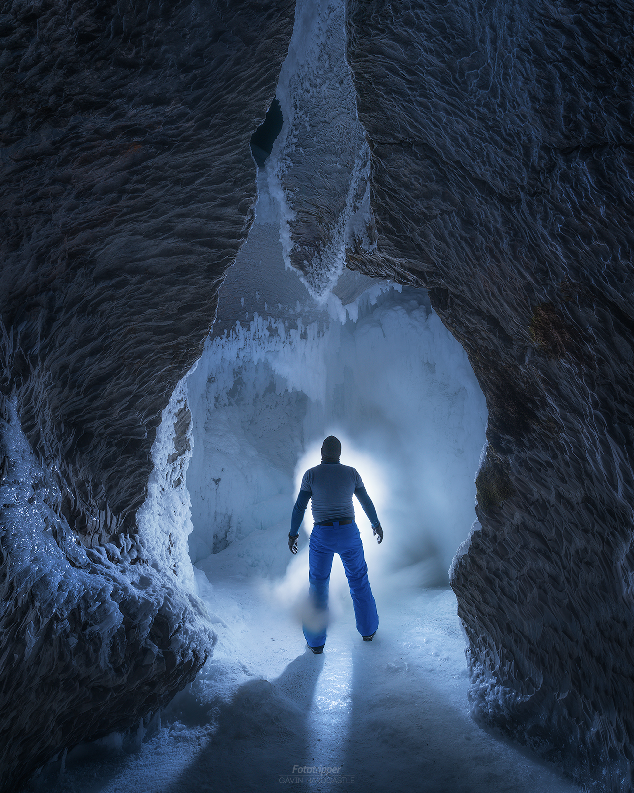
In EXAMPLE 2 I did a much better job of wearing contrasting clothing. The dark tones of my outfit offer strong contrast to the bright white light on the other side of my girthy frame. It’s worth carrying a collection of outdoor clothing that offers both dark and bright colours so that you can wear something that contrasts with the elements of your scene. If you’re standing against a bright white waterfall, darker colours will work better than bright yellow. Conversely, if your backdrop is very dark you’ll want to wear brighter clothing so that you POP against that background.
Are You Ready?
I hope these 6 top tips really help you to improve your landscape selfies. If you have any questions on how I shot these images please post a comment below and I’d love to see what you come up with so please keep in touch over social media.
Thanks for reading
Gavin Hardcastle

Hi Gavin! I found your article very interesting and helpful for a project I am doing at the moment. I wanted to ask you about selfies where you only see are part of the body, for example a pair of legs on the sand leading onto a beautiful view of the sea side. I have been trying different techniques to achieve a good exposure and focus on the whole of the image but I can’t seem to completely get what I want. Would you use a light source on the legs? Or maybe HDR or lens filters to get the right overall exposure? And about the focus I can’t seem to get the landscape in focus as well as the legs, even though my aperture is high my depth of field isn’t great… I am a photography student from london and my brief is to create an advertising campaign for National Trust, so I decided to include the selfie element as a marketing strategy. Any advise you can give me would be very useful! Thank you!
Hi Sabela,
Many ad campaigns use compositing to put together all the elements they need for a shot. Sounds like you’d need to focus stack at the very least. I’d only use a light source if it needs it.